Latest Website Design Trends 2026: 12 Modern Trends & Best Practices
- by Muhammad Raza
- 0 Comments
- 16 minutes read
- 62 Views
The latest website design trends 2026 are most useful when they support the best web design practices: clear navigation, fast performance, accessibility, responsive layouts, and a focused user experience.
Every year brings a new collection of dramatic layouts, unusual typography, immersive animation, artificial intelligence, bold colors, and visual effects. Some become lasting design patterns. Others disappear almost as quickly as they appeared.
The challenge for businesses and web designers in 2026 is not simply identifying what looks modern. It is deciding which website design trends for 2026 genuinely improve a website and which merely make it more fashionable.
A beautiful website that loads slowly, confuses visitors, hides important navigation, or creates accessibility barriers is not strong web design. The most effective modern websites combine visual personality with usability, performance, responsiveness, accessibility, and a clear purpose.
Current 2026 design research reflects that balance. Figma highlights immersive 3D elements, experimental navigation, vibrant colors, bold typography, motion, maximalism, sustainable design, AI-powered interfaces, and other emerging directions. At the same time, accessibility, efficient code, responsive experiences, and thoughtful interaction remain central to good digital design.
This guide explores 12 important web design trends shaping 2026, explains where each trend works, and—more importantly—shows when you should avoid it.
The goal is not to make every website look like a design showcase.
The goal is to build websites people can actually use.
What Is Changing in Web Design in 2026?
Web design is increasingly moving away from a strict separation between design, development, and intelligent software.
Designers can now generate interface ideas with AI, developers work more directly with visual systems, and interactive websites can behave more like applications than static documents.
Figma’s 2026 research illustrates how quickly this workflow is changing. Its State of the Designer report found that AI has become deeply embedded in professional design workflows, while its broader AI research shows collaboration between designers, developers, and product teams becoming increasingly interconnected.
Modern browser capabilities are also expanding.
Google’s Baseline project tracks web-platform features that have become broadly usable across current browsers. Features entering Baseline in 2026 include newer CSS and HTML capabilities such as container style queries and contrast-color(), giving developers more tools for adaptable interfaces.
However, technology alone does not define good design.
A website still has to answer basic questions:
Can visitors understand what this website is about?
Can they find what they need?
Can they use the site on mobile?
Can people navigate it with a keyboard?
Does it load quickly?
Is text easy to read?
Are important buttons obvious?
Does animation help or distract?
Does the interface support the business goal?
With that foundation established, trends become useful tools rather than decorations.
1. AI-Assisted Web Design Becomes a Normal Workflow
Artificial intelligence is no longer limited to generating text or decorative images.
In 2026, AI increasingly participates in the actual design process.
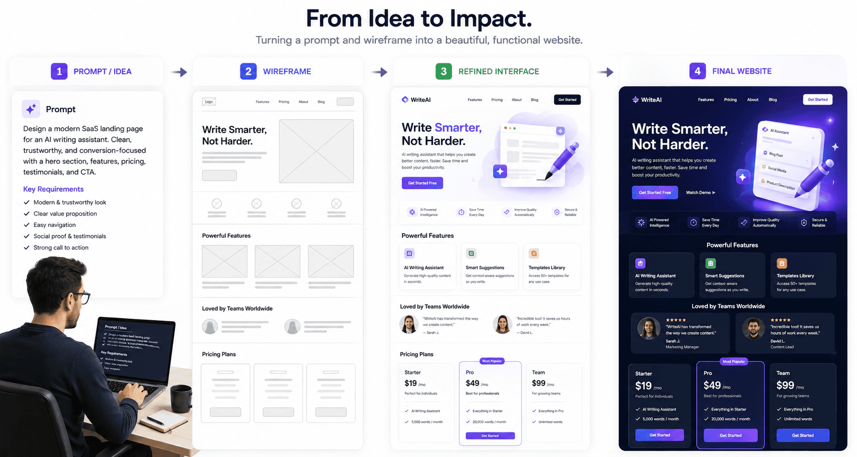
Designers can use AI to explore layouts, generate early interface directions, produce code, experiment with variations, create supporting graphics, and move more quickly between concept and prototype.
Figma’s 2026 State of the Designer research reports widespread generative-AI usage among designers, while Figma continues to expand AI-driven tools such as its design agent and Figma Make.
This does not mean a good website can be created by entering:
“Make me a professional website.”
The role of the designer becomes even more important when generating options becomes easier.
Someone still needs to decide:
- Which layout fits the audience?
- Which information deserves emphasis?
- What should the user do next?
- Is generated content accurate?
- Is the hierarchy clear?
- Does the interface match the brand?
- Is it accessible?
- Can developers maintain it?
Where AI helps most
AI can be highly useful for:
- Early wireframe exploration
- Generating several design directions
- Rapid prototypes
- Placeholder content
- Code experimentation
- Repetitive component work
- Design-system assistance
- Content restructuring
It is less reliable as an unsupervised substitute for strategic design decisions.
The trend is therefore not “AI replaces designers.”
The more useful trend is AI accelerates designers who already understand what good design requires.
2. Bold Typography Becomes Part of the Interface
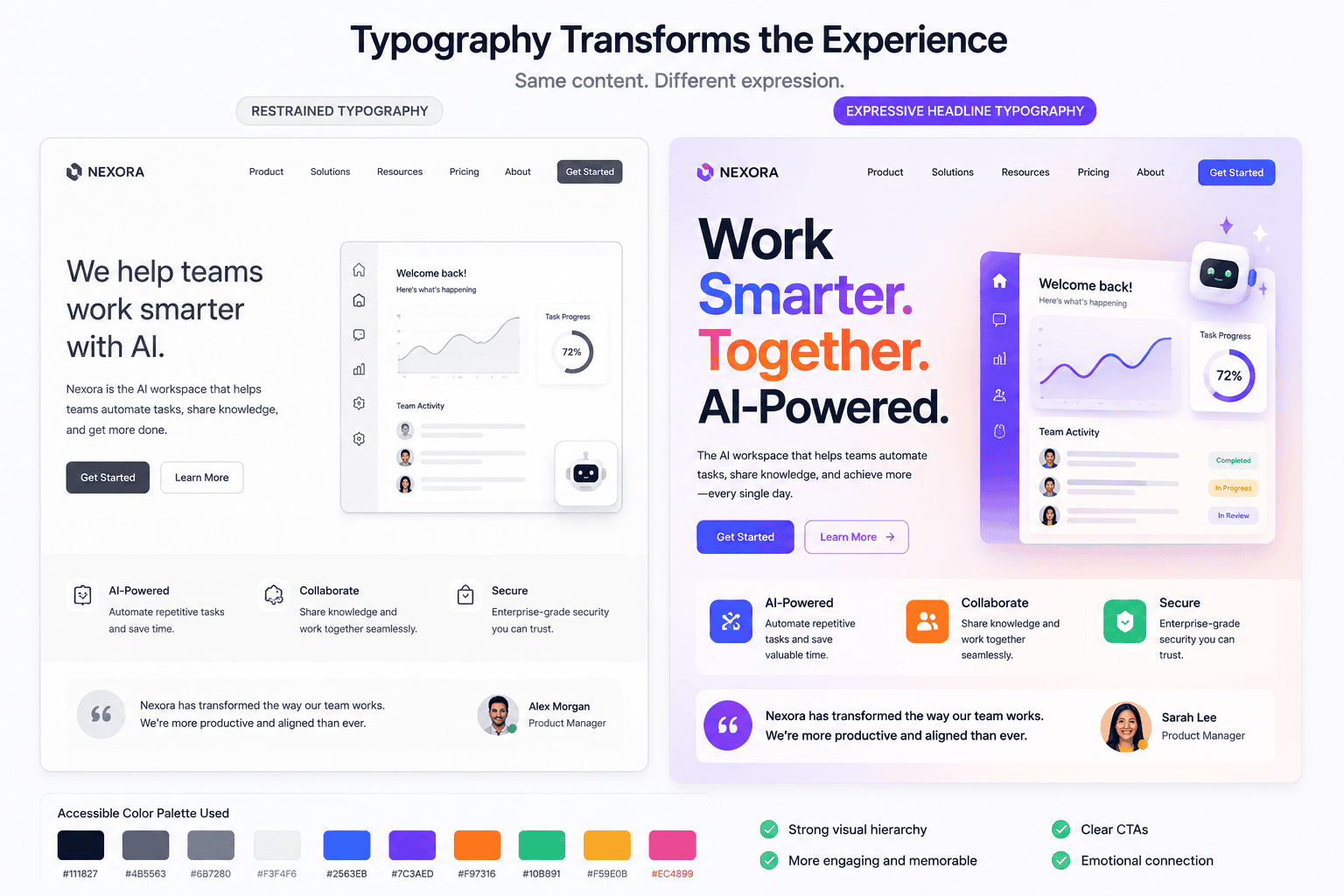
Typography is becoming more expressive.
Large headlines, oversized display text, unconventional type combinations, variable fonts, and editorial-style layouts increasingly give websites their visual identity.
Figma lists bold typography among the prominent web design trends for 2026.
This makes sense.
As templates and AI-generated layouts make common website structures easier to reproduce, typography becomes one of the strongest ways to create a distinctive brand.
A simple page containing strong type can feel more memorable than a complex page full of effects.
How to use bold typography effectively
Large display text works particularly well for:
- Creative agencies
- Portfolios
- SaaS landing pages
- Fashion brands
- Editorial sites
- Product launches
- Personal brands
But typography still needs hierarchy.
Visitors should immediately understand:
Headline → supporting information → action
If everything is enormous and dramatic, nothing feels important.
Do not sacrifice readability
Typography should also remain usable when visitors zoom or resize text.
WCAG guidance states that text should be capable of being resized up to 200 percent without losing content or functionality.
That means decorative typography should be tested rather than treated as a fixed poster.
Avoid:
- Tiny body text
- Extremely narrow columns
- Low contrast
- Text placed over busy images
- Headings that break badly on mobile
- Important text saved only as an image
Typography can be expressive without becoming hostile to readers.
3. Purposeful Motion Replaces Decorative Animation
Web animation has existed for years.
What is changing is how mature websites use it.
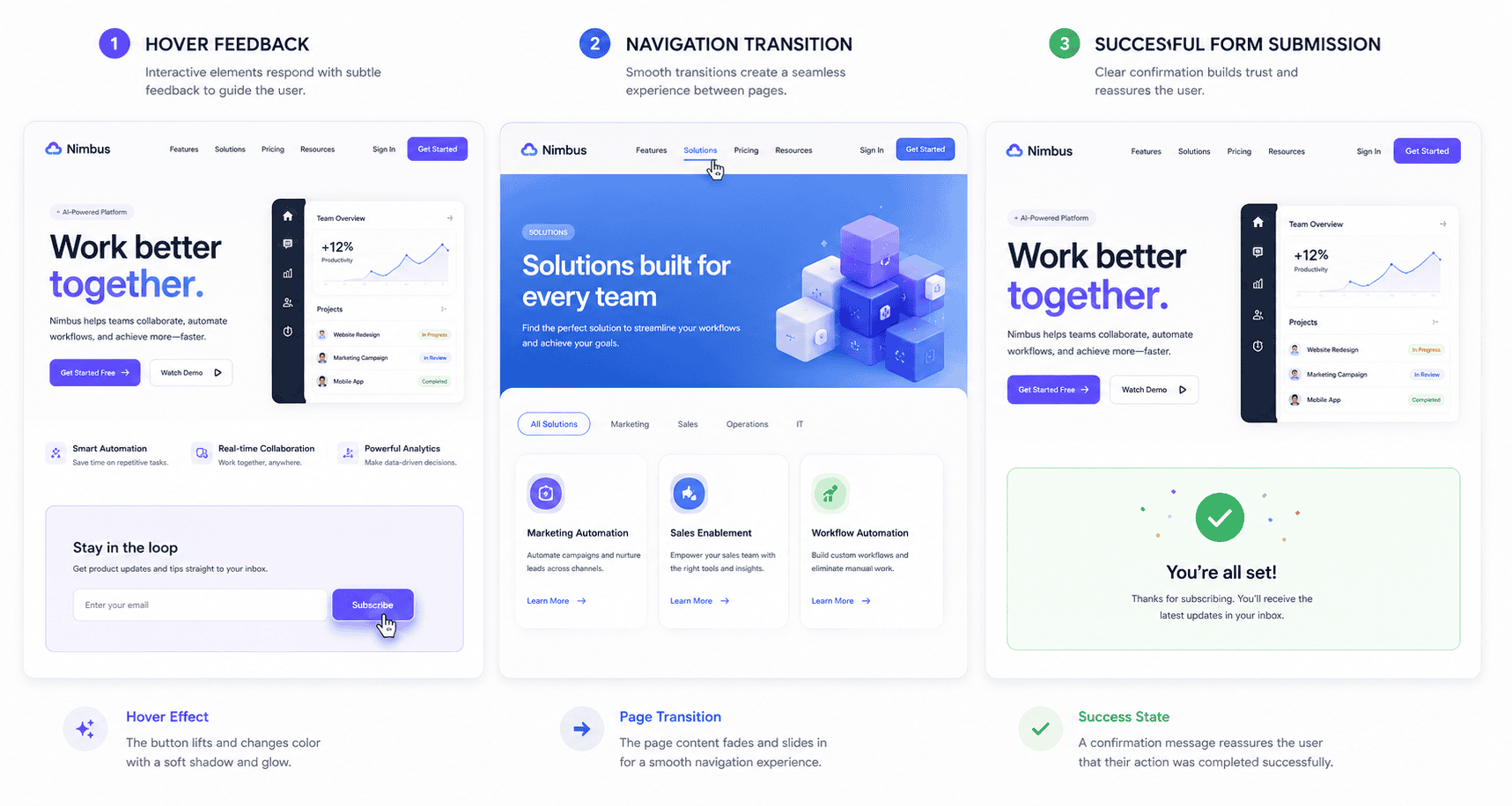
Instead of animating everything simply because the browser can, modern motion increasingly communicates state and direction.
Examples include:
- A button responding clearly when selected
- Content revealing itself as a process progresses
- Smooth transitions between interface states
- Navigation providing visual feedback
- Product visuals responding to interaction
- Loading states that explain what is happening
Figma describes functional motion as an important part of modern web development, while its design trend guidance also identifies animation and motion as significant in 2026.
Good motion answers a question
Useful animation tells the user something.
For example:
Where did this panel come from?
Was my action successful?
Which item is selected?
What should I notice next?
When motion answers none of those questions, it may simply be visual noise.
Avoid motion overload
Excessive animation can:
- Slow perceived performance
- Distract from content
- Make navigation frustrating
- Create accessibility problems
- Increase development complexity
Sites should also respect user preferences such as reduced-motion settings.
Motion should support the interface, not become the interface.
4. Immersive 3D Becomes More Practical
Three-dimensional website experiences are becoming easier to build and more common.
Figma places 3D and immersive elements at the top of its 2026 web-design trend list.
This trend can include:
- Interactive product models
- Three-dimensional illustrations
- Depth-based hero sections
- Scroll-controlled scenes
- Spatial product demonstrations
- Layered interfaces
- WebGL experiences
3D is especially useful when it helps visitors understand an object or product.
For example, showing a 3D product that visitors can rotate can provide genuine value.
An architectural studio might use depth to communicate space.
A technology company could explain a complicated system with an interactive visualization.
When 3D becomes a problem
Immersive experiences can also create large performance costs.
Heavy assets, scripts, shaders, videos, and interactive scenes can delay loading and increase rendering work.
That means the question should not be:
Can we build this in 3D?
Ask:
Does 3D help the visitor understand or experience something that a simpler design cannot communicate as effectively?
If the answer is no, a static image may be better.
5. Expressive Color Returns
Minimalist neutral websites remain useful, but 2026 is also seeing stronger use of expressive color.
Figma identifies vibrant color palettes as a major current direction.
Brands increasingly use:
- Bright accents
- Gradient transitions
- Unexpected color pairings
- Saturated backgrounds
- Strong contrast
- Color-coded interface states
This can help websites feel less interchangeable.
Color should still communicate
A good color system is not simply attractive.
It tells users something.
For example:
- Primary color = important action
- Red = error
- Green = success
- Neutral colors = supporting interface
- Accent color = selected state
If every section contains a new collection of colors, the visual system becomes harder to understand.
Accessibility still applies
Strong colors do not automatically mean good contrast.
Text and interactive components need appropriate contrast against their backgrounds.
Do not rely on color alone to communicate information.
For example, an error field should not merely become red. It should also contain an icon, label, or explanatory text where appropriate.
6. Dark Mode Becomes a Designed Experience, Not a Color Inversion
Dark interfaces continue to be popular, and Figma includes dark mode among its 2026 web-design trends.
But good dark mode requires more work than changing white to black.
A properly designed dark interface considers:
- Text contrast
- Image brightness
- Surface hierarchy
- Shadows
- Borders
- Form controls
- Charts
- Illustrations
- Brand colors
Pure black backgrounds with pure white text can sometimes feel harsher than carefully chosen dark-gray surfaces.
Should every website have dark mode?
No.
Dark mode is particularly useful when:
- Users spend long periods in the interface
- The product is a dashboard or application
- The audience expects theme controls
- Content is frequently consumed in low-light settings
A simple business brochure site may not need two complete color systems.
Implement dark mode because it benefits users, not merely because it is fashionable.
7. AI Chatbots Evolve Into Interface Components
Chatbots are no longer limited to support bubbles floating in the corner of a website.
Figma identifies AI chatbots and agentic interfaces as important developments in modern web design.
The more interesting change is that conversational AI is becoming part of interface architecture.
A visitor might ask a website:
“Which plan includes analytics for five team members?”
Instead of manually comparing a large pricing table, an AI interface could help locate the answer.
Other possibilities include:
- Product recommendations
- Documentation search
- Guided onboarding
- Lead qualification
- Support assistance
- Account actions
- Content discovery
Chat should not replace good navigation
One common mistake is assuming AI removes the need for traditional interfaces.
Visitors still need:
- Menus
- Search
- Categories
- Clear calls to action
- Product pages
- Documentation
AI should provide another way to interact with information, not become a mandatory gateway.
A visitor should not have to hold a conversation with a bot simply to find your pricing page.
8. Minimalism Becomes More Purposeful
Minimalism is not disappearing.
Instead, it is becoming more disciplined.
The strongest minimal websites do not simply remove content. They remove unnecessary competition for attention.
Purposeful minimalism uses:
- Clear typography
- Strong spacing
- Limited color systems
- Focused calls to action
- Fewer visual distractions
- Simple navigation
- Deliberate imagery
The goal is not emptiness.
The goal is clarity.
Minimal does not mean vague
Some websites reduce their homepages so aggressively that users no longer understand what the company does.
A dramatic headline such as:
“Create what comes next.”
may sound elegant, but it tells a first-time visitor almost nothing.
Good minimal design still communicates:
- Who you serve
- What you provide
- Why it matters
- What visitors should do next
Removing information is useful only when the remaining information becomes easier to understand.
9. Maximalism and Controlled Chaos Grow at the Same Time
Interestingly, minimalism and maximalism are both visible in 2026.
Figma lists maximalism, collage, neo-brutalism, and retrofuturism among current design directions.
This reflects a broader reaction to uniform template-driven design.
Maximalist websites may use:
- Layered graphics
- Multiple type styles
- Intense color
- Unusual grids
- Collage
- Decorative illustration
- Large visual transitions
- Deliberately unconventional composition
These approaches are particularly effective for creative brands that need personality.
Controlled chaos is still controlled
Good maximalism looks spontaneous but is carefully organized underneath.
It still needs:
- Visual hierarchy
- Consistent interaction patterns
- Readable content
- Obvious navigation
- Responsive behavior
The visitor should experience personality without losing orientation.
A design agency portfolio can tolerate more experimentation than an online banking interface.
Context determines how far experimentation should go.
10. Experimental Navigation Needs Stronger Usability Testing
Figma also identifies experimental navigation as a 2026 trend.
Designers increasingly explore alternatives to the traditional header menu.
Examples include:
- Full-screen navigation
- Floating controls
- Cursor-driven navigation
- Spatial menus
- Side rails
- Gesture-based interactions
- Dynamic menus that change by context
These approaches can make a site memorable.
They can also make it difficult to use.
Familiarity has value
Users have learned common interface conventions.
A logo in the upper-left often returns home.
Underlined or clearly styled text indicates a link.
A visible menu helps visitors understand available sections.
Breaking conventions can create delight when the replacement is obvious.
Breaking them without providing an intuitive alternative creates friction.
Before using experimental navigation, test it with people who did not design the website.
If they repeatedly ask where the menu is, the design is not successfully communicating.
11. Accessibility Moves From Compliance Task to Design Foundation
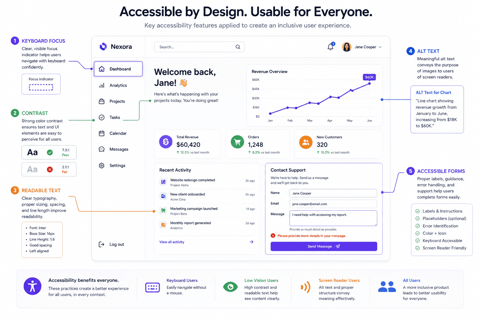
Accessibility should not technically be described as a “trend.”
It should be part of professional web design.
But it deserves inclusion because modern design discussions increasingly treat accessibility as a core requirement rather than something added after launch.
Figma’s 2026 guidance explicitly connects modern web design with accessibility and inclusive practices. Chrome for Developers likewise defines accessibility as designing websites and applications that disabled people can interact with meaningfully and equally.
Accessibility affects everyday design decisions
Designers should think about:
- Color contrast
- Keyboard navigation
- Focus states
- Form labels
- Text size
- Heading hierarchy
- Alternative text
- Responsive zoom
- Captions
- Reduced motion
- Touch target size
- Semantic structure
Accessibility is not merely about screen readers.
Different users may experience:
- Low vision
- Color-vision differences
- Limited mobility
- Hearing loss
- Cognitive disabilities
- Temporary injuries
- Situational limitations
A person using a phone outdoors in bright sunlight may benefit from the same strong contrast that helps someone with low vision.
Design accessibility before development
It is easier to create accessible interfaces from the beginning than to repair them after launch.
For example, if the design system includes accessible colors, clear focus states, readable typography, and well-designed controls from the start, developers have a much stronger foundation.
Accessibility is therefore a design-system responsibility, not only a developer checklist.
12. Performance-First Design Becomes More Important as Pages Get Richer
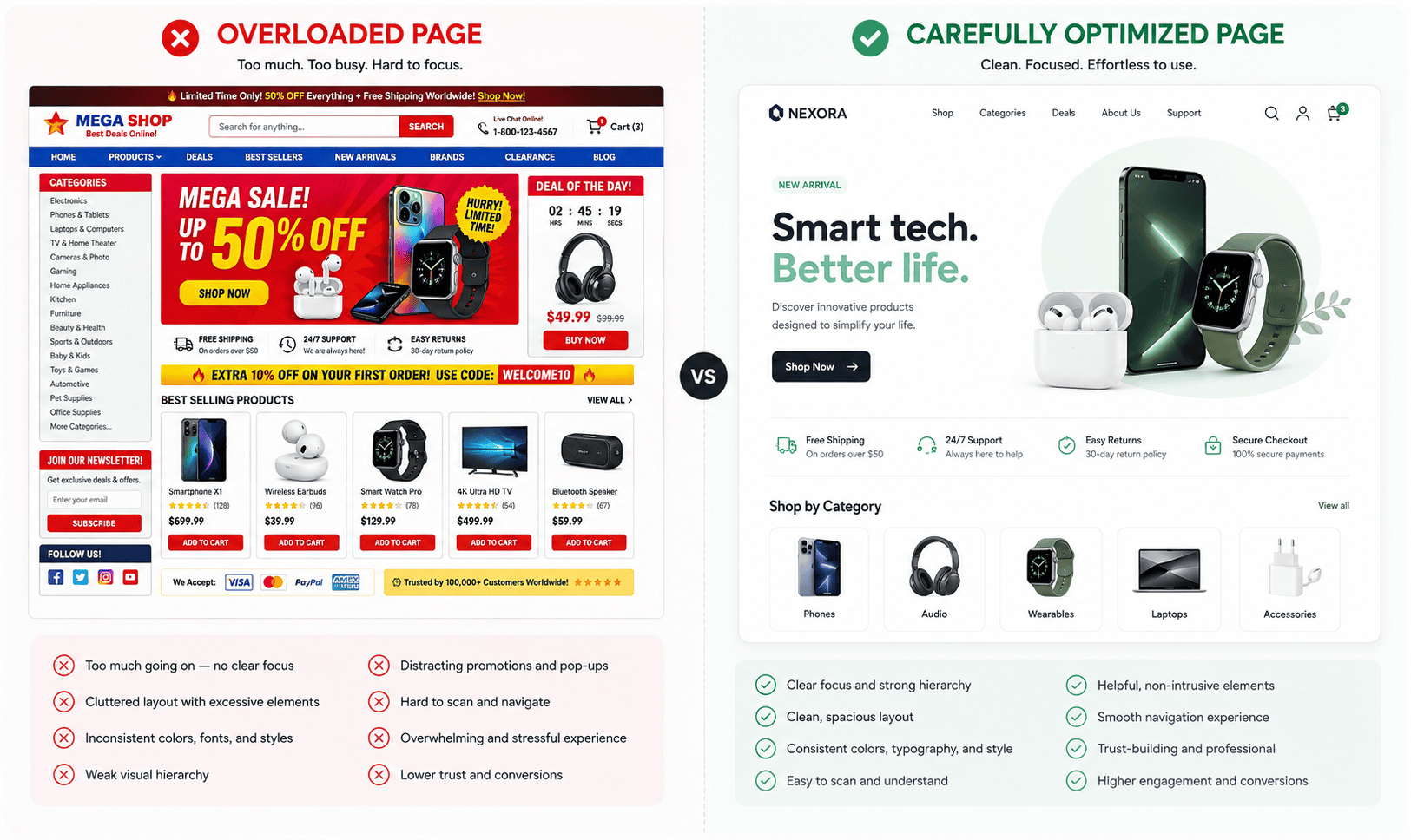
Websites are becoming visually richer at the same time users expect them to feel immediate.
This creates tension.
High-resolution photography, custom fonts, large JavaScript bundles, 3D scenes, video backgrounds, analytics scripts, AI widgets, and animations can all add weight.
Performance therefore becomes part of the design decision.
web.dev emphasizes building web experiences that are fast, accessible, secure, and compatible across browsers. It also continues to recommend Core Web Vitals as important measures of user experience, including Interaction to Next Paint for responsiveness.
Designers influence performance earlier than developers
Performance problems often begin in the design phase.
A designer may specify:
- A 30 MB hero video
- Six font families
- Multiple autoplay animations
- A 3D scene
- Large background imagery
- Several embedded widgets
The developer can optimize these assets, but they cannot make their cost disappear.
Designers should ask:
What is the lightest experience that still achieves the intended effect?
Optimize visual assets
Practical approaches include:
- Correctly sizing images
- Using modern image formats
- Compressing media
- Lazy-loading appropriate assets
- Limiting unnecessary fonts
- Avoiding autoplay video when unnecessary
- Reducing third-party scripts
- Loading functionality only when needed
Performance-first design does not require boring websites.
It requires intentional websites.
Which Web Design Trends Should You Actually Use?
Do not choose trends before identifying the website’s purpose.
Start with four questions.
1. Who is the audience?
A children’s entertainment website and a law firm’s website should not follow the same visual strategy.
2. What is the primary action?
Examples include:
- Buy a product
- Request a quote
- Create an account
- Read content
- Book an appointment
- Contact the company
Your design should make this action easier.
3. What does the brand need to communicate?
A luxury brand may benefit from restrained typography and cinematic imagery.
A playful technology startup may use vibrant colors and expressive animation.
4. Does the trend create measurable value?
Before adding an effect, ask what it improves.
Does it improve:
- Comprehension?
- Navigation?
- Engagement?
- Product understanding?
- Accessibility?
- Brand recognition?
- Conversion?
- Efficiency?
If you cannot explain what the feature contributes, you may not need it.
Web Design Trends That Can Hurt a Website
Some popular techniques become harmful when used carelessly.
Autoplay background video
It can create visual impact but may consume bandwidth, reduce performance, distract users, and compete with page content.
Scroll hijacking
Changing the expected behavior of scrolling can make a site feel cinematic, but it can also make navigation frustrating.
Invisible navigation
A menu should not become a puzzle.
Excessive parallax
Subtle depth can work. Large amounts of movement can feel disorienting.
Low-contrast minimalist design
Light-gray text on a white background may look elegant in a design mockup but be difficult to read.
Unnecessary custom cursors
They can add personality to portfolios, but changing familiar pointer behavior may reduce clarity.
AI-generated visual sameness
AI can generate polished design rapidly. Without strong creative direction, however, many generated interfaces can begin to look interchangeable.
The solution is not avoiding trends.
It is applying judgment.
How to Modernize an Existing Website for 2026
You do not need to redesign an entire site merely because the year changed.
A more effective process is to improve the areas with the greatest user impact.
Step 1: Audit usability
Check:
- Navigation
- Calls to action
- Mobile experience
- Forms
- Content readability
- Search
- Important user journeys
Step 2: Test performance
Use tools such as Lighthouse, PageSpeed Insights, and browser developer tools to identify bottlenecks.
Step 3: Review accessibility
Test:
- Keyboard navigation
- Focus indicators
- Contrast
- Form labels
- Heading structure
- Zoom
- Alternative text
- Motion
Automated tests are useful, but they do not identify every accessibility issue.
Step 4: Simplify the visual system
Define:
- Fonts
- Spacing
- Colors
- Buttons
- Cards
- Forms
- Iconography
Consistency often makes an old website feel more modern than simply adding new effects.
Step 5: Add one meaningful modern feature
Instead of implementing every trend, choose one.
It might be:
- Better typography
- Thoughtful animation
- A dark theme
- More expressive color
- AI-powered support
- A useful 3D product view
Measure whether it improves the experience.
Frequently Asked Questions
What are the biggest web design trends for 2026?
Major web design trends in 2026 include AI-assisted design, immersive 3D, expressive typography, functional motion, vibrant color systems, dark mode, AI interfaces, maximalism, experimental layouts, accessibility-focused design, sustainable practices, and performance-first experiences.
Is minimalism still popular in web design in 2026?
Yes. Minimalism remains useful, but effective minimalist websites focus on clarity rather than simply removing content. Strong typography, spacing, hierarchy, and clear calls to action are more important than making a website visually empty.
Is AI replacing web designers?
AI is increasingly helping designers generate concepts, prototypes, code, and variations, but professional web design still requires strategy, user understanding, accessibility knowledge, branding, judgment, testing, and quality control. Current industry research shows AI becoming part of designers’ workflows rather than eliminating the need for design expertise.
Should every website use animation?
No. Animation is useful when it explains state, directs attention, provides feedback, or improves storytelling. Decorative animation that delays users or makes content difficult to consume can reduce usability.
Is dark mode necessary for modern websites?
No. Dark mode can improve user choice and may work especially well for applications, dashboards, and content used in low-light environments, but it adds design and maintenance work. Implement it when it benefits your users.
How important is accessibility in web design?
Accessibility is fundamental. Websites should be designed so people with disabilities can meaningfully interact with their content and functionality. Accessibility considerations include keyboard navigation, text resizing, contrast, focus states, alternative text, semantic structure, forms, captions, and motion preferences.
Are 3D websites good for SEO?
3D itself does not make a website rank better. Heavy 3D assets can actually hurt usability or performance if poorly implemented. Use 3D when it adds genuine product or storytelling value and optimize the implementation carefully.
What makes a website look outdated in 2026?
A website may feel outdated because of inconsistent typography, poor mobile layouts, cluttered navigation, low-quality imagery, weak spacing, inaccessible controls, slow performance, or an interface that does not match current user expectations. Modernization should focus on usability and quality rather than merely copying fashionable visual effects.
Conclusion
The most important web design trends for 2026 are not individual styles.
They reflect a larger shift toward websites that are more intelligent, expressive, interactive, and adaptable.
AI is becoming part of the design workflow. Typography is becoming more distinctive. 3D and motion can create richer experiences. Color and maximalism are giving brands new ways to escape generic template aesthetics. AI chatbots and agents are changing how visitors interact with information.
At the same time, the fundamentals are becoming more important—not less.
Accessibility must survive bold visual experimentation.
Performance must survive richer media.
Navigation must survive unconventional layouts.
Brand identity must survive AI-generated design.
And users must remain able to understand what a website is asking them to do.
The best website in 2026 will not necessarily be the one using the largest number of trends.
It will be the one that selects the right ideas for its audience and executes them with restraint.
Use trends to create personality, improve communication, and make interactions easier.
Do not use them merely to prove that your website was redesigned recently.
A modern website should feel modern because it works exceptionally well—not because every element moves when someone scrolls.